APP DESIGN
FOR ONLINE SHOPPING STORE HABITUAL

Description
This is my newest personal project for the fictional online shopping store "Habitual" I made for a UX/UI course on Udemy. I created a design system, sitemap, user journey for registration & making a purchase, low fidelity wireframes, and high fidelity design for mobile application.
This has been a great project because I learned a lot of new things and really enjoyed building the whole concept for this application.
Sitemap
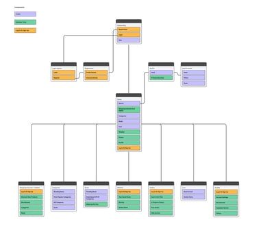
I created a sitemap to help realize what needs to be on the app to make it functional and logical. I wanted to have a map that could navigate me while creating wireframes.
User journey
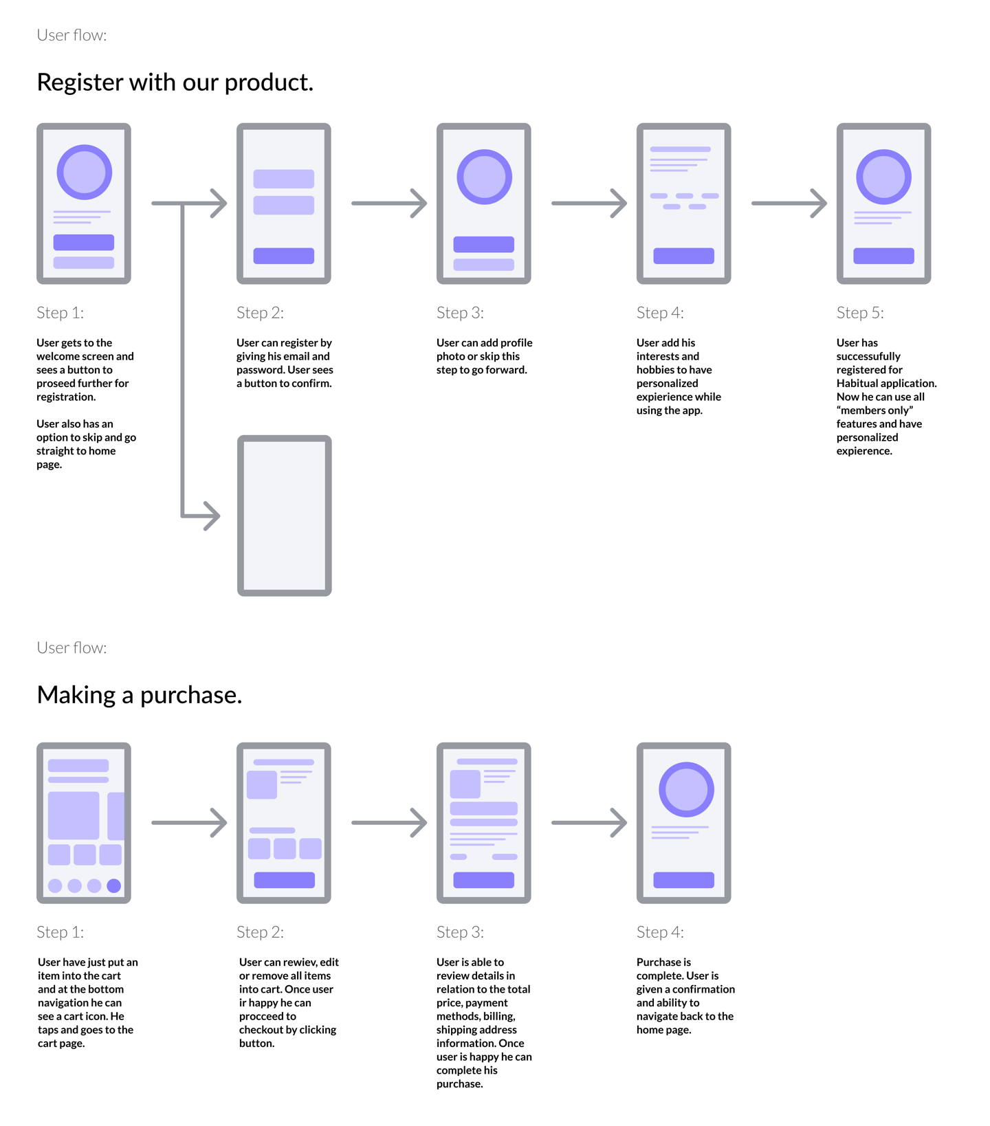
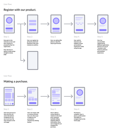
Before wireframing, I thought about user journey/user flow: a path taken by application user to complete a task. The first one - registration, second - making a purchase. These two flows helped me realize the importance of the detail and what user must see and find easily.
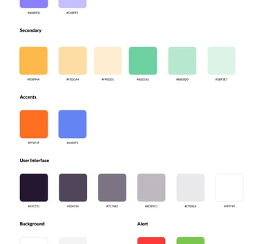
Design system

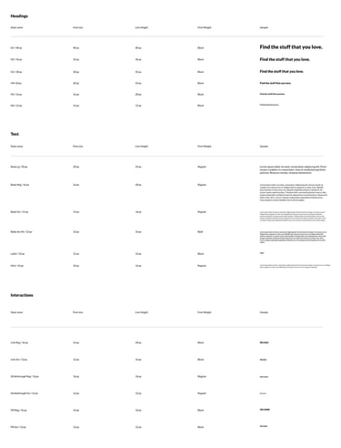
First time ever I created a design system for a project. Firstly I started choosing a font that would be easy to adjust, afterwards I created typography to use in this application.
Typography
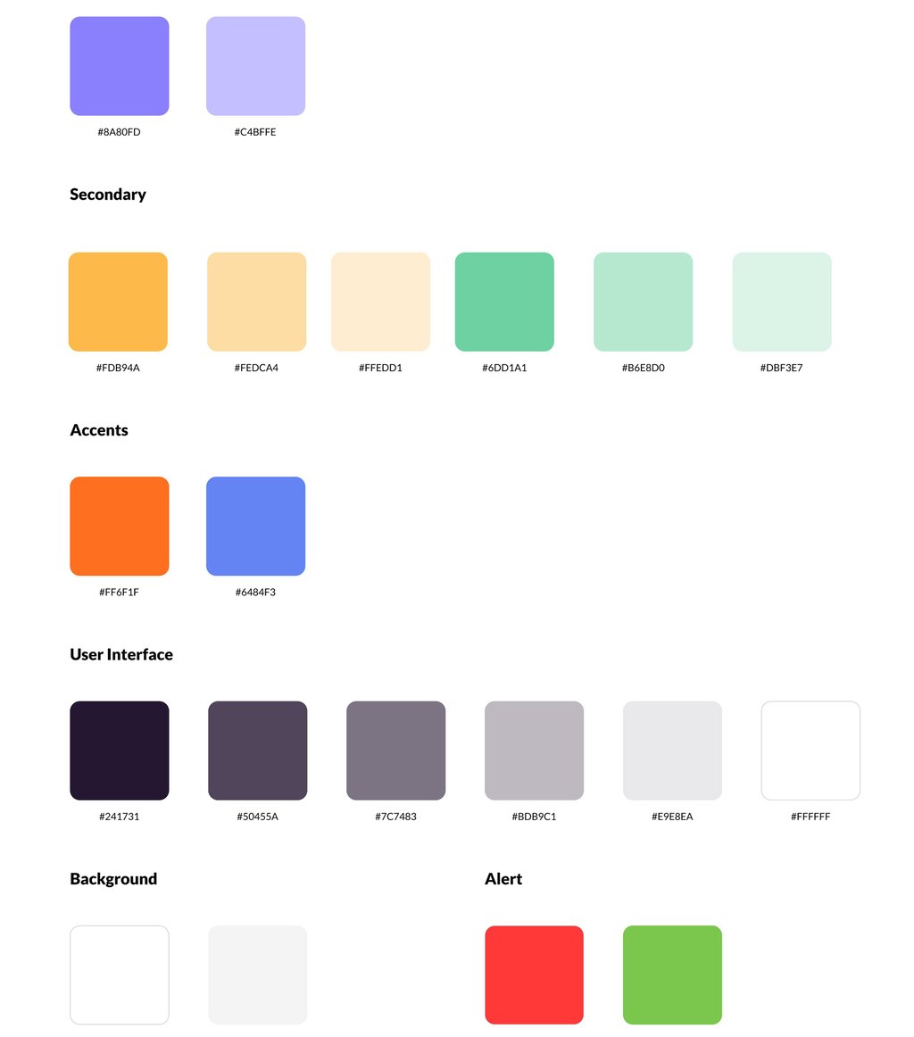
Colors
Before making a decision on which color palette to use I looked through lots of examples and variations. Finally, I chose calm, but on the other hand bright, happy and optimistic-looking color palette.
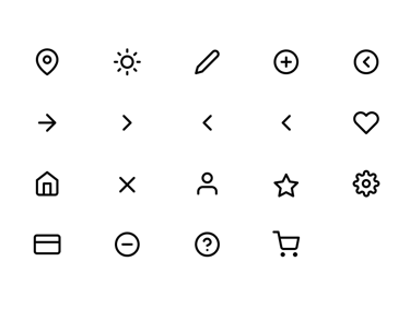
Iconography
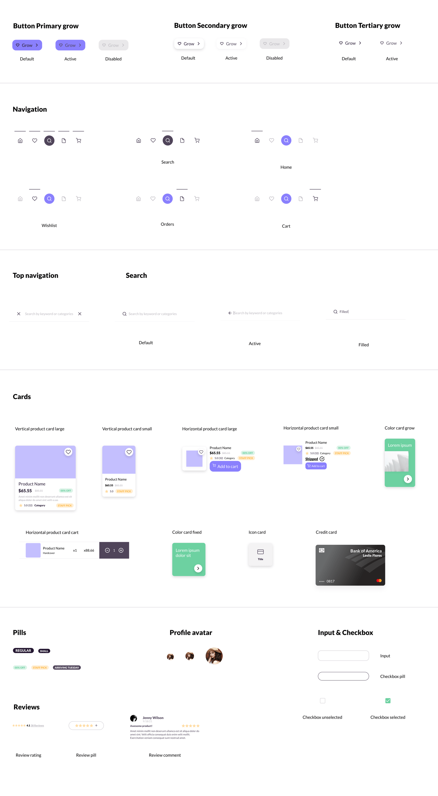
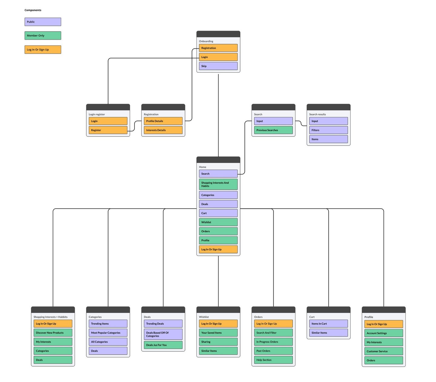
Components
I created a number of components that would be used in the High fidelity design. I thought about various scenarios where any of the component could be reused.
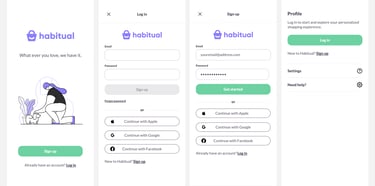
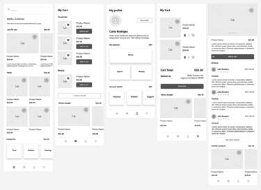
Low Fidelity Wireframes
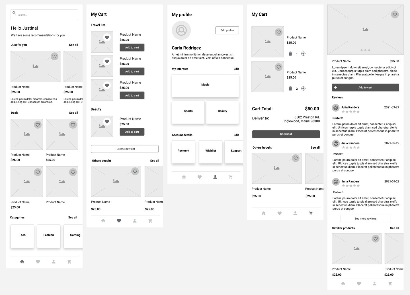
High Fidelity Wireframes
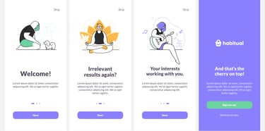
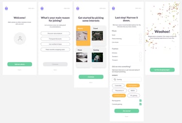
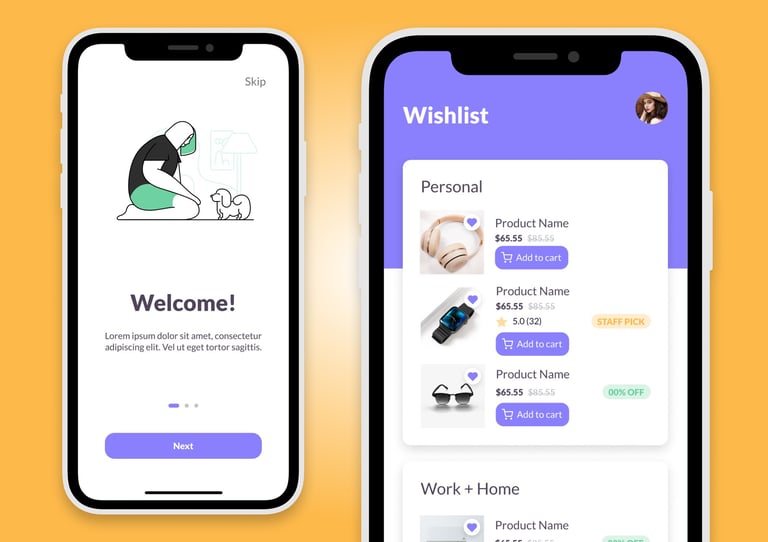
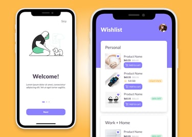
1. Onboarding
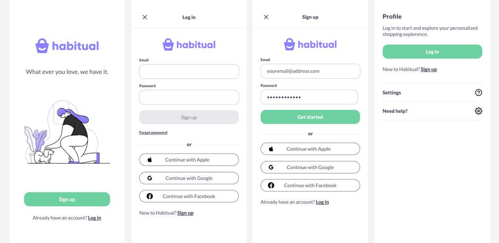
2. Log in
3. Registration
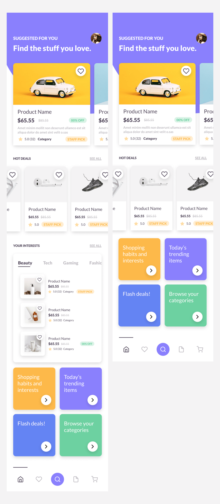
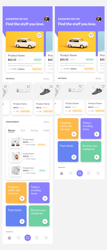
4. Home page
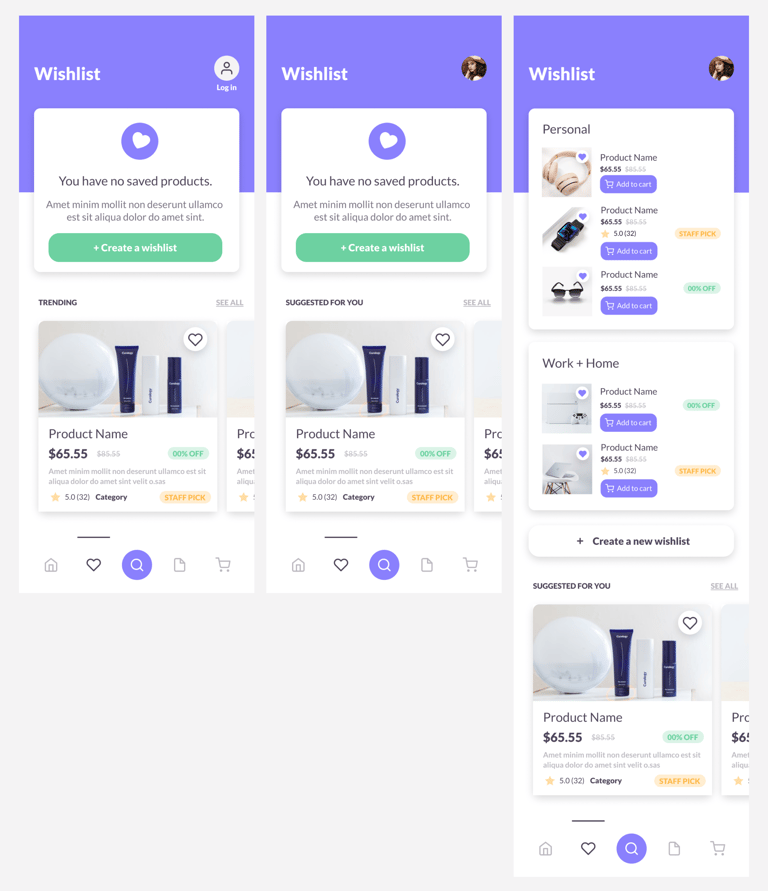
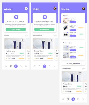
5. Wishlist
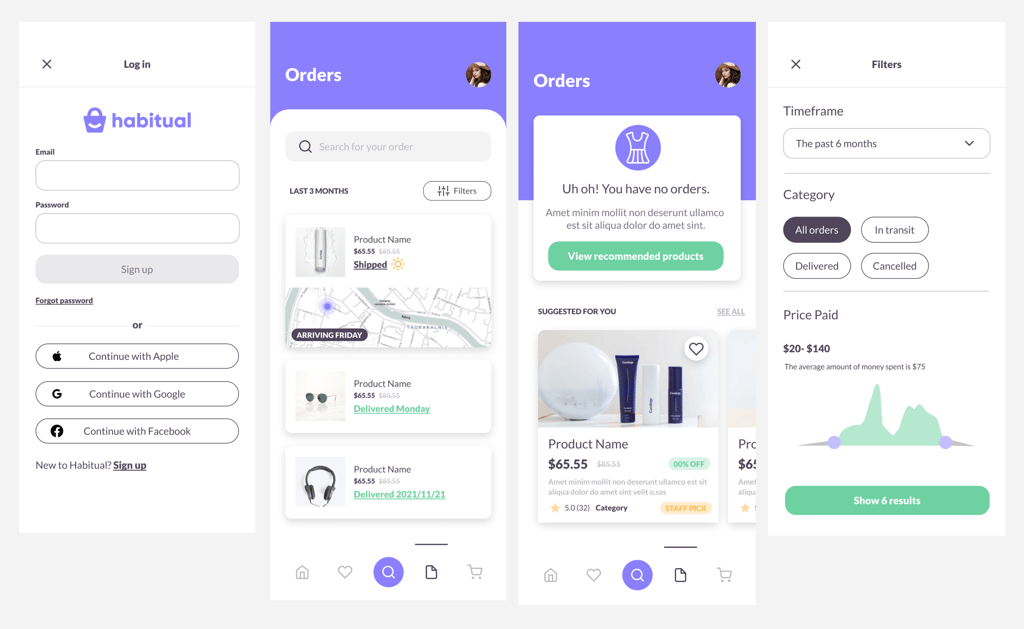
6. Orders
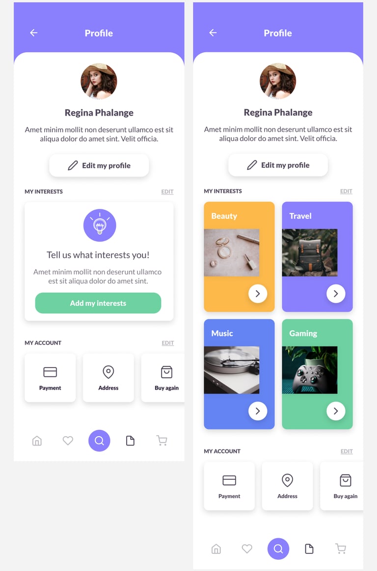
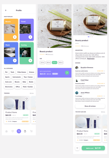
7. Profile
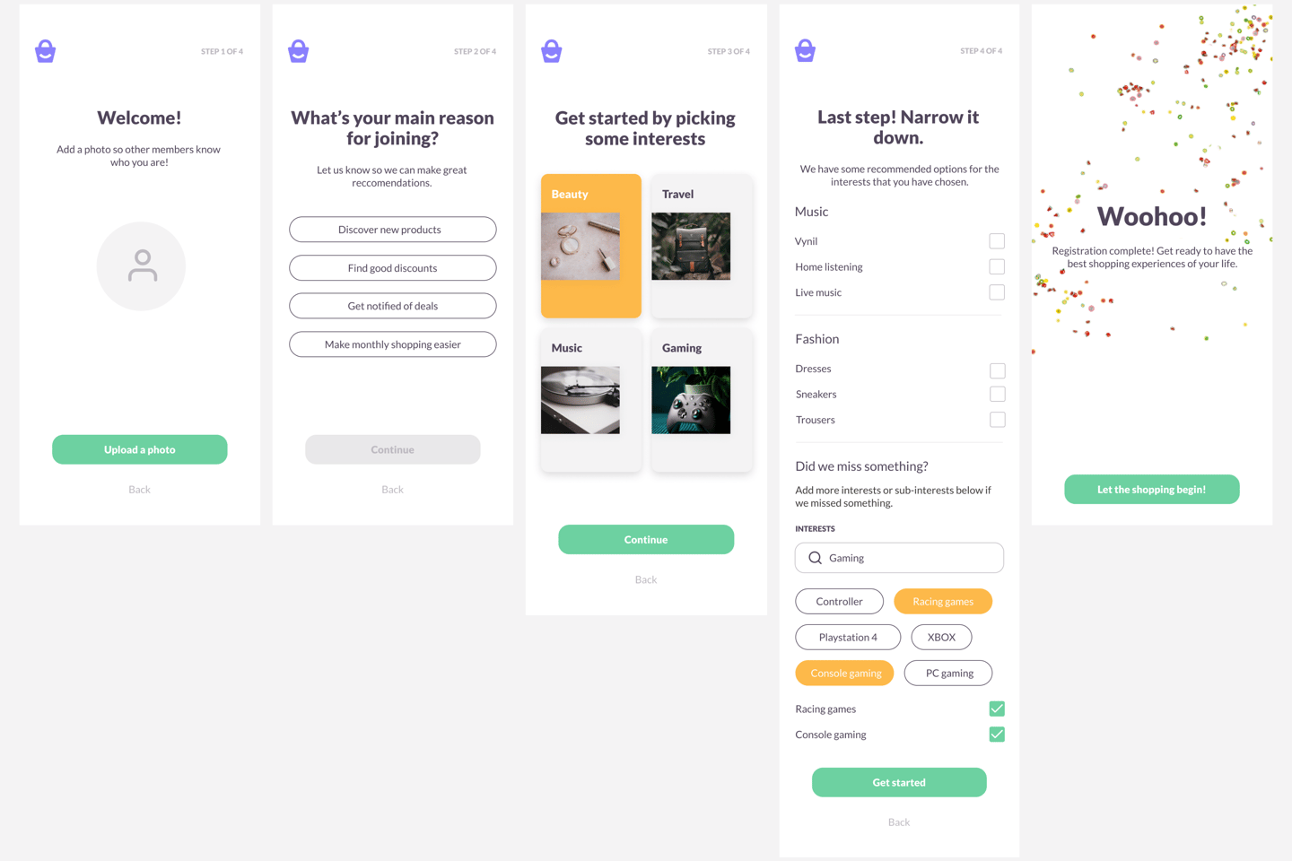
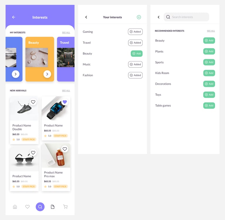
8. My interests
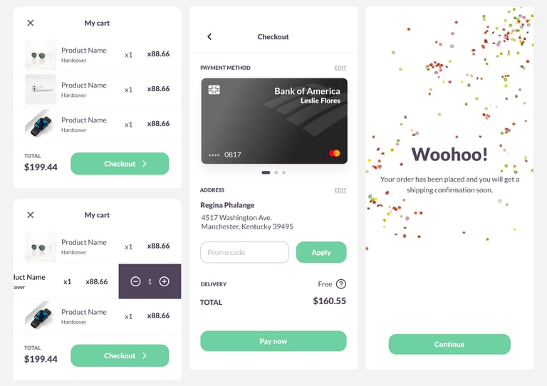
9. Cart
10. Categories / Product page
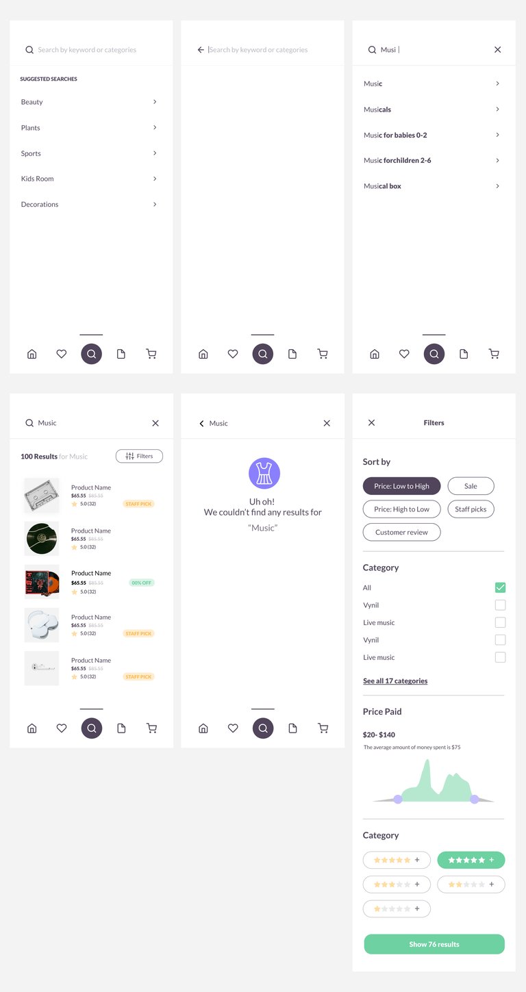
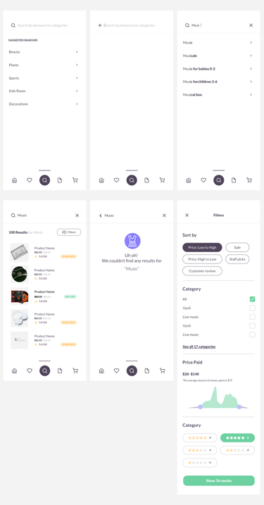
11. Search