
The product
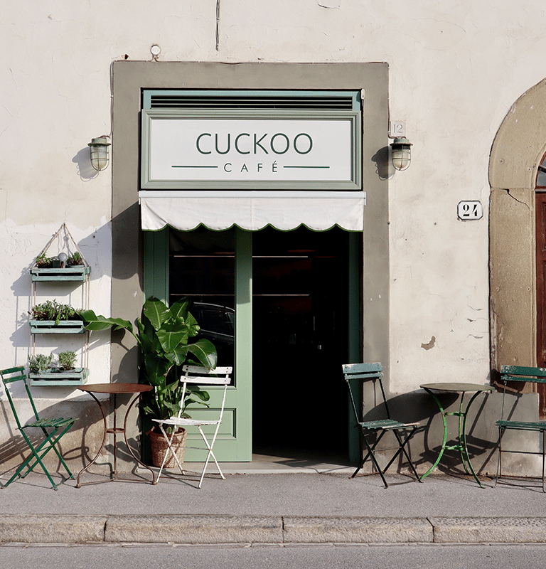
Cuckoo café is a modern place in the old town of Vilnius city where you can get high-quality coffee and fresh snacks. This is a place for adults who lack time but wants the best quality that exists.
My role & responsibilities
Role: UX designer leading the app, and responsive website design from conception to delivery
Responsibilities: conducting interviews, paper and digital wireframing, low and high-fidelity prototyping, conducting usability studies.
User research: summary
I conducted interviews and created empathy maps to understand the users I’m designing for and their needs. A primary user group identified through research was working adults who are tired of waiting in line to order coffee and grab a nice snack at least a few times a week. This user group confirmed initial assumptions about Cuckoo café customers, but research also revealed that time was not the only factor limiting users from getting coffee at home. Other user problems include frustration getting at a café and not finding a free table, others point out expensive service and lack of loyalty programs.




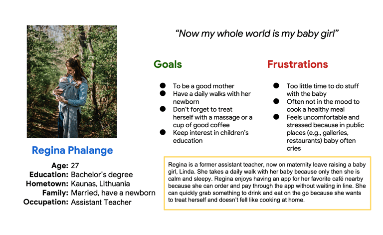
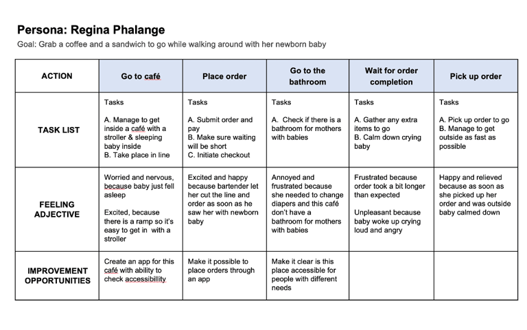
Persona: Regina
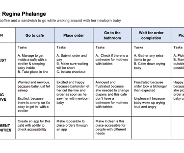
Regina is a new mom who needs a quick pick-up of coffee and snack options because they have so little time since the baby, who is calm only while walking outside so waiting in line is frustrating and annoying.
User journey map
We have made quality our habit. It’s not something that we just strive for – we live by this principle every day.
Paper wireframes
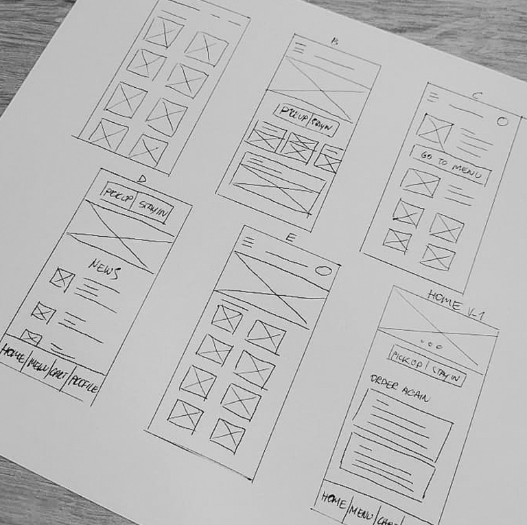
It was essential to invest time in paper prototypes so every page would reflect on user pain points and would help users to use the app with as little disappointment as possible. These wireframes represent how the home page came to life.
Low fidelity prototype
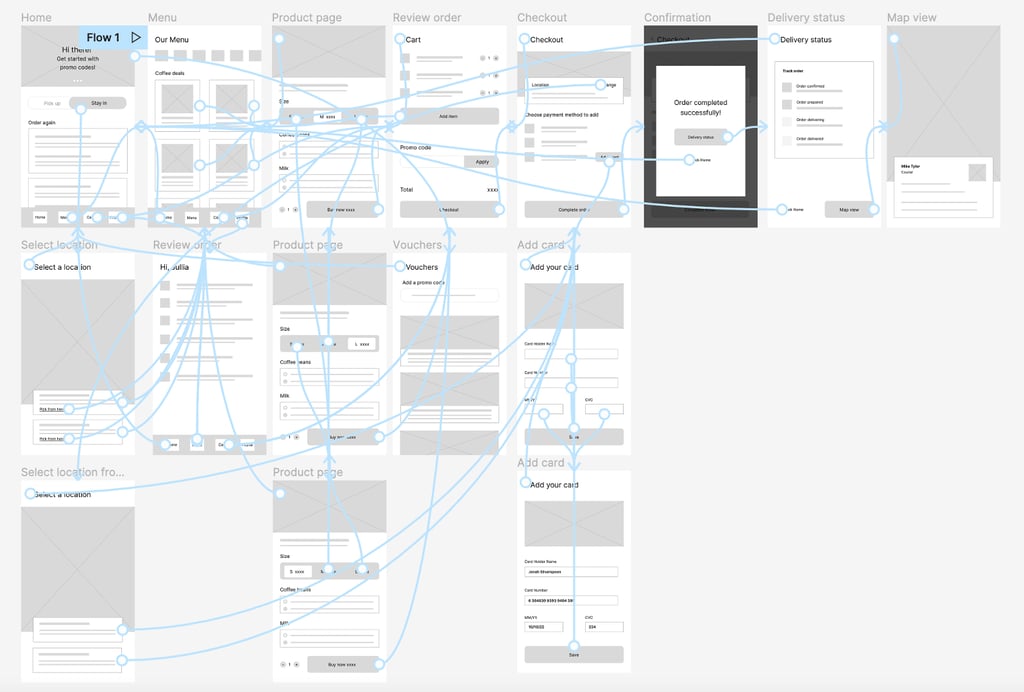
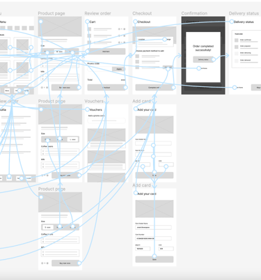
The low-fidelity prototype connected the primary user flow of ordering a coffee, so the prototype couldbe used in a usability study with users.
PARAMETERS
Usability study
STUDY TYPE: Unmoderated usability study
LOCATION: From home
PARTICIPANTS: 5
Findings:
1 Users want to remove the pick-up stay-in option from the Home page
2 Users want a better button wording, cause some are confusing
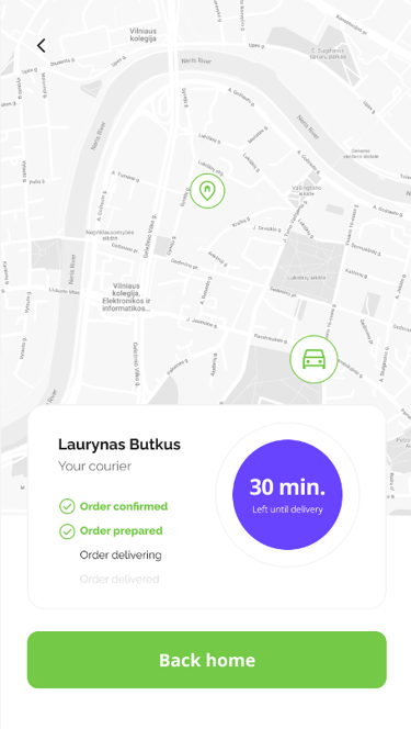
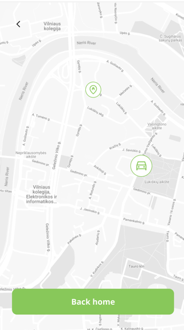
3 Users want a better way after purchase to see a delivery map
4 Detailed delivery information after successful payment is confusing
FROM LOW FIDELITY TO HIGH FIDELITY
Mockups
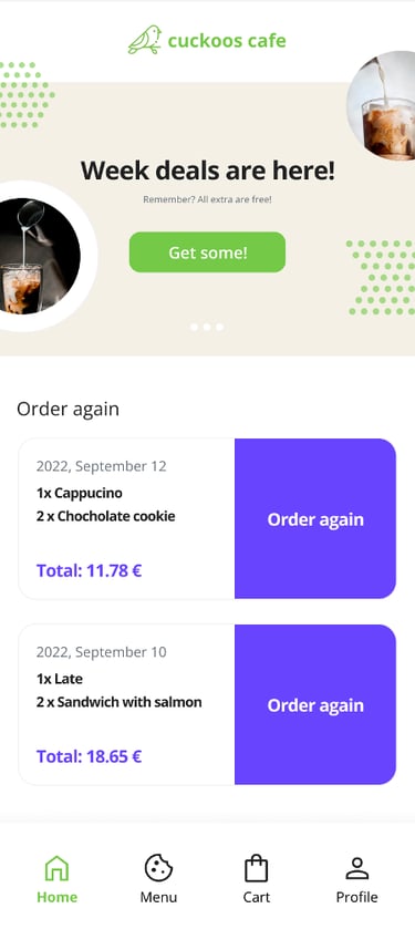
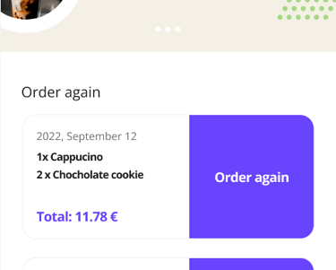
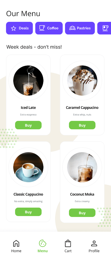
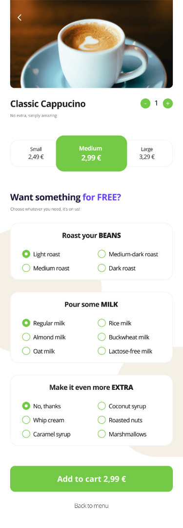
In early designs on the home page, there was an option for pick-up or stay-in options. After usability studies, I removed this option because it was confusing and users were questioning this element. I also put a logo on the top.
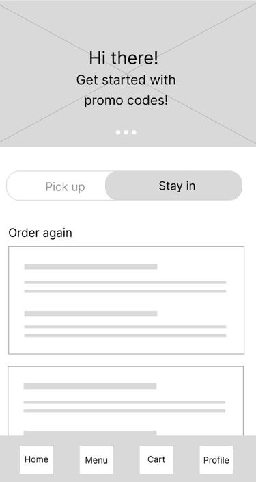
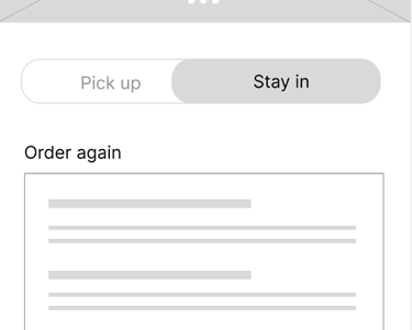
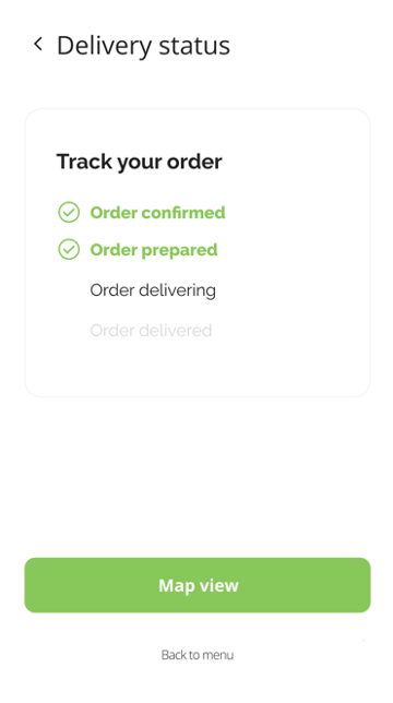
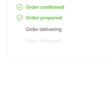
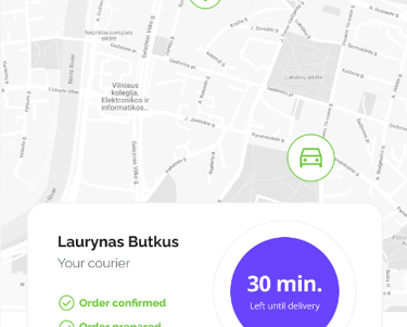
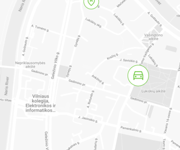
The second usability revealed frustration with the delivery status screen and map view screen. In order to help users to feel I combined those screens into one.
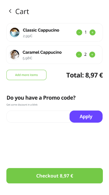
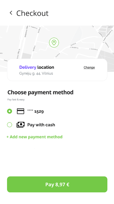
Key mockups
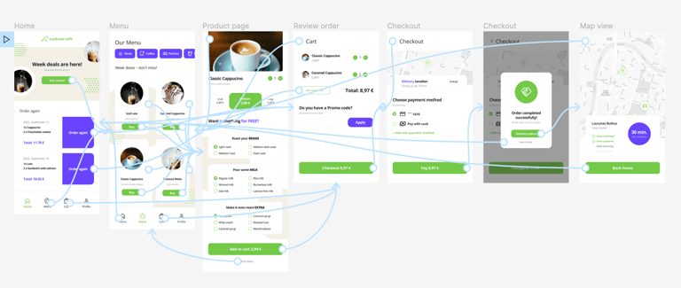
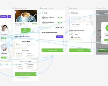
High-fidelity prototype
The final high-fidelity prototype presented an easier and more clear flow for users to follow.
Accessibility considerations
Used icons in various places to help make navigation easier
Provided access to users who are vision impaired through adding alt text to images for screen readers
Good color contrast between text and background color
Takeaways
Next steps:
Conduct another round of usability studies. See if users pain points have been effectively addressed
Conduct more user research to determine any new areas of need
What I learned: while designing I learned that design process is never ending loop and there is the most important figure at the center of it all – user.
