
Hey you!
Sincerely yours,
Justina
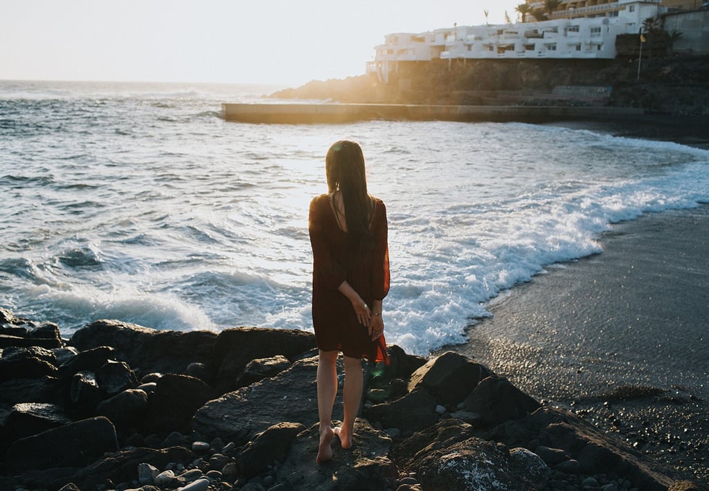
Welcome to my virtual space, where I wanna share my design/projects and passion for photography.
Hope you gonna see something interesting, beautiful and if in any case you want to contact me, don't hesitate and do that!