

The product
New path is place for young adults who are becoming parents for the first time. Lots of them are not aware of many aspects beginning from planning to have a baby to moment when they’re going home with a newborn. There a lot of questions and we are ready to answer all of them.
My role & responsibilities
Role: UX designer leading the app, and responsive website design from conception to delivery
Responsibilities: conducting interviews, paper and digital wireframing, low and high-fidelity prototyping, conducting usability studies, iterating on designs, determining AI and responsive design.
User research: summary
I conducted interviews to understand the users I’m designing for and their needs. A primary user group identified through research was pregnant women who are lost because of so much unverified information. They are facing the fact that there is no safe place to find medically confirmed articles, that are written by doctors. Research also revealed that there are men who lack information about their pregnant partner and how they can help and be there for them. They want to be involved.


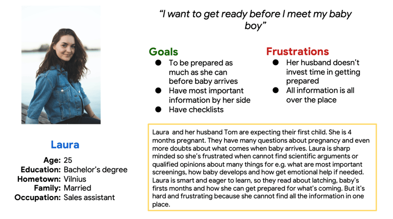
PERSONAS
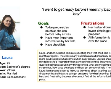
Persona 1: Laura
Problem statement: Laura is 4 months pregnant young woman who wants to be prepared when her baby arrives. She is frustrated about that her husband isn’t involved and that the information on the internet is all over the place, often not verified.
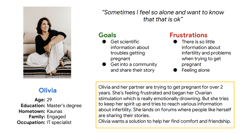
Persona 2: Olivia
Problem statement: Olivia is struggling with infertility and lack of information about it. She wants that her prolem wouldn’t be a taboo, but loudly spoken about.
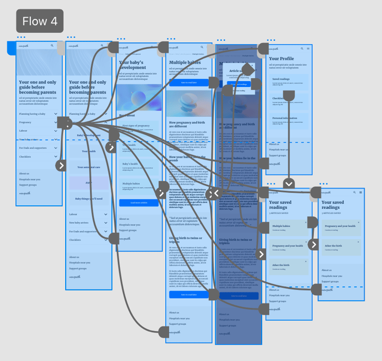
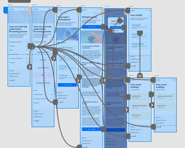
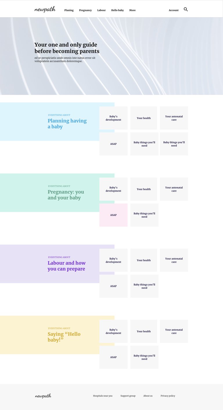
Sitemap
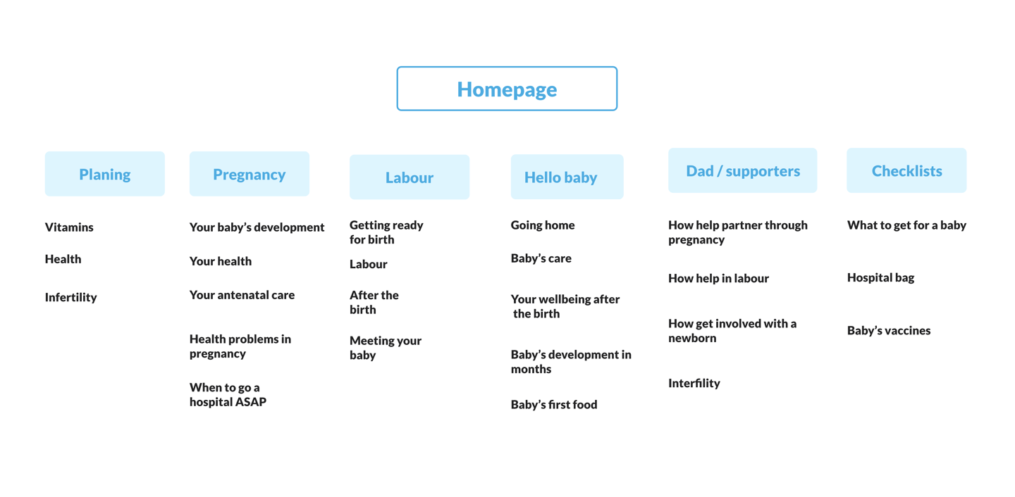
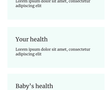
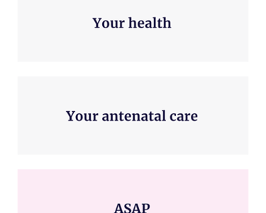
Designing a responsive website I was dedicated to make it easy and logical to navigate. After user interviews I made clear which topics are important and has to be on the web.
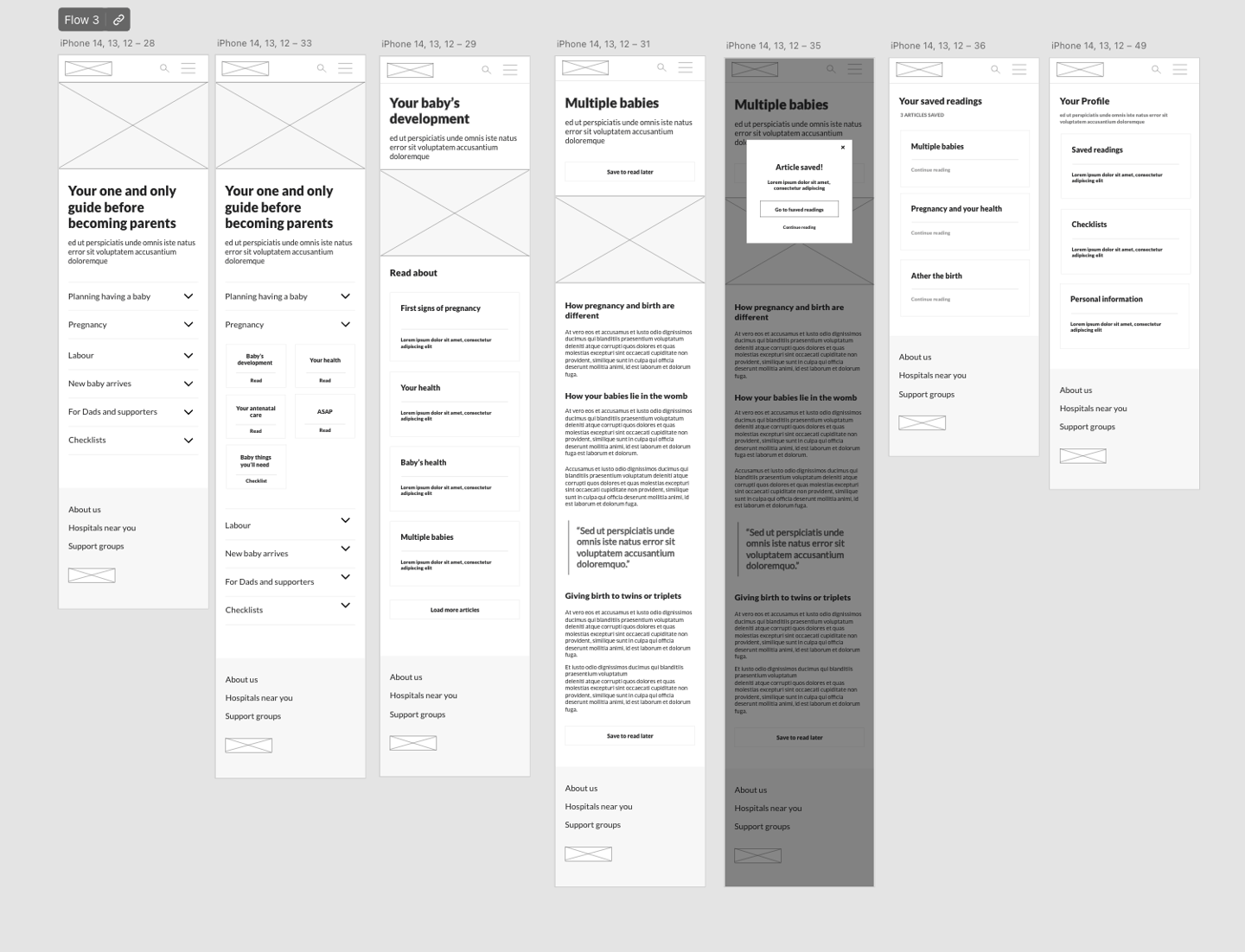
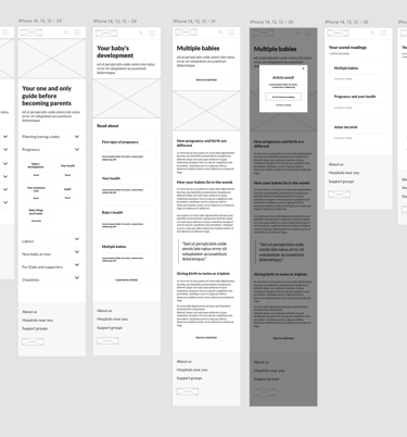
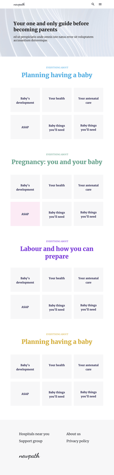
Digital wireframes
PARAMETERS
Usability study
STUDY TYPE: Unmoderated usability study
LOCATION: From home
PARTICIPANTS: 5
Findings:
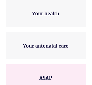
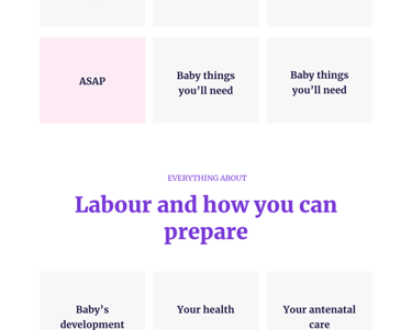
1 Subcategories. Users wanted a more clear way of picking a subcategory in the home page
2 Breadcrumbs. Users want a breadcrumbs to easy navigation
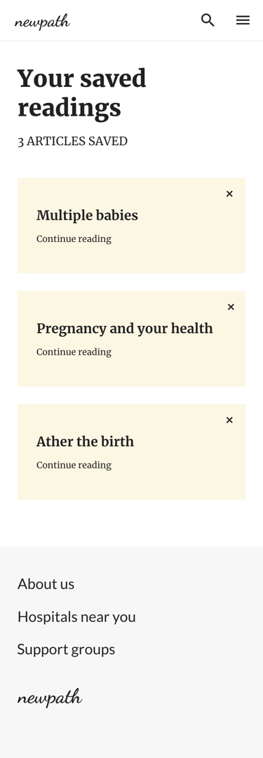
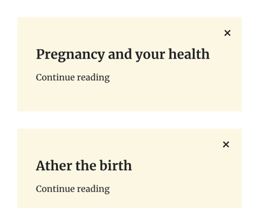
3 No option to delete. In the Saved reading the was no way to remove article
FROM LOW FIDELITY TO HIGH FIDELITY
Mockups
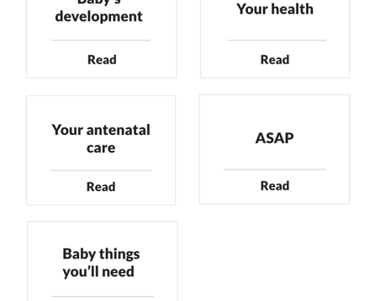
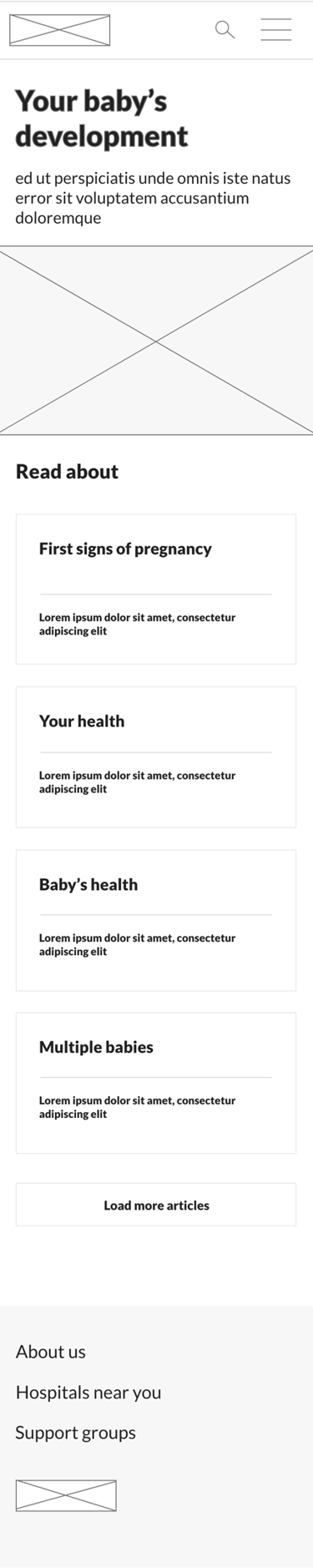
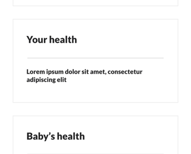
There were comments that subcategory selection is too overwhelming. I had a goal to make it easy and quick to scan and pick the right choice.
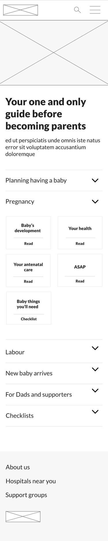
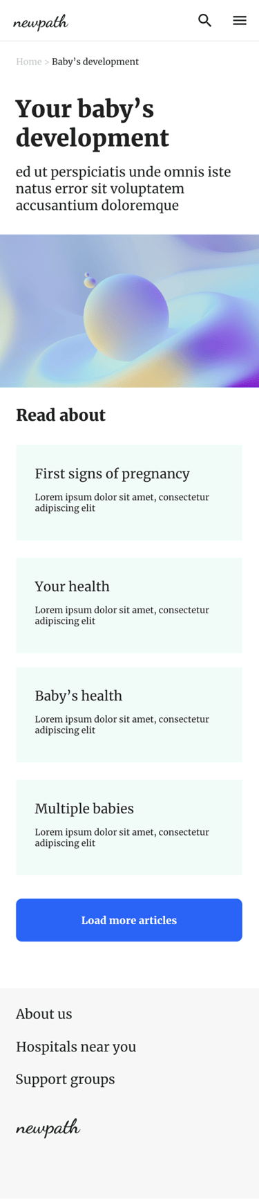
Usability study revealed that people are missing breadcrumbs and are a bit lost choosing category. I tried help improve that by choosing some color and adjusting typography.
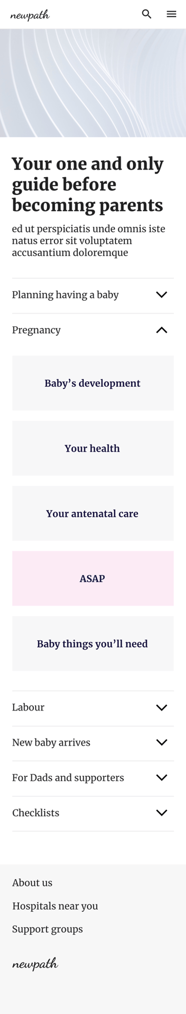
Key mockups
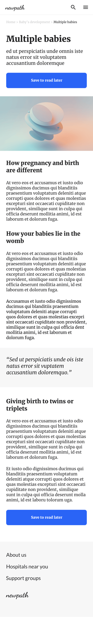
High-fidelity prototype
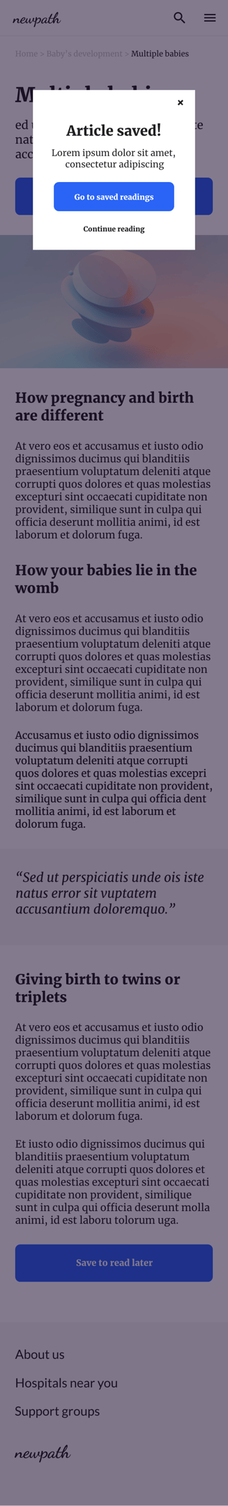
The final high-fidelity prototype presented an easier and more clear flow for users to follow.
Accessibility considerations
Good color contrast between text and background color
Hamburger menu for easy and quick navigation
Clear category’s labels, that can be read by screen readers
Responsive designs
Takeaways
What I learned: while designing I learned that design process is never ending loop and there is the most important figure at the center of it all – user.
Next steps:
Conduct another round of usability studies. See if users pain points have been effectively addressed
Conduct more user research to determine any new areas of need